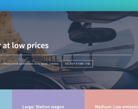
Template #1
The one thing modern online users hate is to scroll through a lot of content to find what they need. This car rental website template tackles that issue head-on. This car rental website design goes for a large thumbnail based approach that makes it look fantastic and straightforward to use. What makes this template unique though is the subtle color accents that makes every part of the car rental website highly visible. Just a cursory glance is enough to get a fair understanding of how the website works and where you need to go for a particular thing. It manages to be attention grabbing without being flashy, and the subdued hues give it a very professional look.
The layout is elegant and aimed at being as user-friendly as possible. The dark themed approach gives it a very modern and classy look while also making it easy to be used in low light conditions. Then comes the scalability. It is equally accessible across devices ranging from smartphones to extra-wide monitors. There is no obscuring or overlapping of content and everything scales correctly to retain that classy look without sacrificing functionality. The most significant achievement of this template is that by keeping the design elements to a minimum, the loading time has been reduced drastically and speed is everything when it comes to an online business. Car Rental Websites designed with this free template will load quickly regardless of the speed of the internet slow allowing your visitors to access your site even from remote places. This is the perfect template for those who value ease of use over everything else.
Download Template #1 Create Car Rental Website
Template #2
Many websites today commit the cardinal crime of being designed like a maze. There is usually no way to return to a specific part of the site that was previously visited, and the user generally has to scroll all the way to the top to find what they are looking for which is counter-intuitive to a great online experience. This will probably force the user to go looking somewhere else. This free car rental website template solves that problem with a very novel idea. Instead of having the menu bar on the top as is the norm for most websites, the menu bar is on the left, and it stays there no matter how far users scroll down the site. This allows people to instantly access any part of the website from anywhere as all that is needed is a click. This positioning of the menu bar in this unique way achieves two remarkable results. It makes navigating extremely easy while still displaying the main content of the website prominently.


