Mobile-friendly, mobile optimized, responsive website - you've probably come upon these buzz words and grasped their meaning rather intuitively. They all refer to similar web design concepts and are commonly used as synonyms. Still, they represent different evolution stages. The invasion of all sorts of mobile devices into our lives and the related transformation of browsing and buying habits has called for a responsible and responsive reaction on the mobile web scene. Now it’s no longer enough to just have an eye-catching website - it must be mobile-friendly, too.
A mobile-friendly website (in a broad sense) is one that displays flawlessly on all handheld devices (smartphones, tablets, PDAs etc.). Its main characteristics:
- Loads quickly – Users love fast-running websites!
- Easy to read – The font size and all contents are adapted to mobile view.
- Easy to navigate – The menus are organized intuitively to fit the limited space.
- Reduced scrolling – Both vertically and horizontally.
- Avoids Flash – Most portable devices do not support Flash.
Google - the world's most popular search engine and trendsetter, has included the mobile friendliness to the factors it uses to rank websites. The mobile search ranking change came into force on April 21, 2015. As Googlers say, this update was not arbitrary - it rather reflects the increased needs and expectations of mobile users. It’s a way to adapt Google search algorithms to today’s usage patterns.
Mobile-friendly pages are now shown more distinctly and rank higher in mobile search results. To designate these websites, Google adds a ‘mobile-friendly’ label into their mobile search snippets.

NOTE: This update applies to search rankings on mobile devices only and affects search results in all languages worldwide. What's more, it is relevant to individual pages, not entire websites.
The bottom line is that searchers can now more easily find relevant results with readable content - no more zooming, horizontal scrolling and unplayable multimedia. Given that a lot of people use mobile devices only to access the Internet, website owners - especially commercial ones, should seriously consider going mobile. This is their only chance to stay competitive in search rankings and drive revenue.
Of course, if your website is not mobile optimized yet, it's not the end of the world. Since Google uses other ranking signals (content quality, domain, multimedia, SEO etc.), too, the mobile-friendly update will not affect desktop searches. Still, responsive design is the wisest investment, if you’re dealing with mobile active consumers or audience that need to make purchases on the go.
WHAT YOU LOSE, IF YOUR WEBSITE IS NOT MOBILE-FRIENDLY

Every day, more and more consumers migrate from desktop to mobile or tablet usage to make online banking transactions, purchase goods and services or just surf the web. According to a recent study more than 2 billion mobile users will make some form of e-Commerce from their mobile devices by the end of 2017 - compared to 1.6 billion in 2014.
Expectedly, growth of mobile digital content purchasers in developing markets is slowlier. But as the study shows, in a number of developed markets mobile devices are likely to account for over half of online transactions in the next five years. The numbers speak for themselves.
THE CHOICE IS YOURS
Let's review the three basic website designs that can take you on the road to your mobile presence. Your options are:
1) MOBILE-FRIENDLY
A mobile-friendly website is designed for displaying on various devices - desktop computers, smartphones, tablets etc. It will appear exactly as it does on a desktop, only smaller. By using this approach, you spare no efforts to design a separate web page.
Still, the website content looks significantly more cramped than on a classic PC. You have to scroll and zoom to navigate your website. Small buttons, graphics, menu options and too close links are hard to handle. Hence, a "mobile-friendly" website doesn’t really stand up to its name.
2) MOBILE OPTIMIZED
A mobile optimized website is a separate version of your website designed precisely for mobile devices, NOT desktops. It comes up automatically for users accessing your web page from mobile devices. It contains the most important features of your original website. This version fits perfectly within the dimensions of all handheld devices and provides a lot of quick "tap" buttons.
The drawbacks: extra cost for designing a separate website; additional marketing and SEO efforts; certain elements of the full version will drop out from the mobile version. Alternatively, users can switch over to "desktop view" - usually there is a Full Mode link at the bottom of the page.
3) RESPONSIVE
This is the most advanced web design concept in terms of mobile friendliness. That’s why we will dive deeper into its fundamentals. The term "responsive web design" (RWD) was originally coined by Ethan Marcotte in A List Apart in 2010, where he pointed out the three technical pillars of RWD: fluid grids, flexible images, media queries. As he poetically explains:
"Responsive web design offers us a way forward, finally allowing us to "design for the ebb and flow of things."
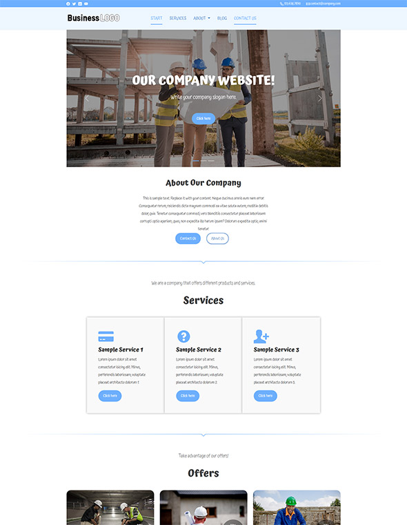
The basic idea behind RWD is that websites should respond to user's behaviour and environment - device type, platform, screen resolution and orientation. A mobile friendly website usually consists of a header with navigation panel, logotype and search field, and a footer with text distributed in blocks. This design concept leads to enhanced visual perception and readability for mobile users. In the end, you have one website for every screen.
This design doesn't detect your browser type or device. It automatically changes the page orientation to fit the screen in use. In contrast to the mobile-friendly website, RWD doesn’t require lots of scrolling or zooming. And unlike the mobile-optimized website, you're seeing the full website on your phone.
The essence of RWD, however, lies beyond adjustable screen resolutions and automatically resizable images - it's rather a whole new way of thinking about web design. As Jeremy Keith, a respected voice within the web industry, says:
"Stop thinking in PAGES. Start thinking in SYSTEMS."
In his post "Mobile Friendly VS Mobile Responsive" Peter Butler, Australian web entrepreneur, puts it very simply:
"Base your design on the online journey you need to take people on,
your information architecture so to speak, what doorways do you want them to 'walk through'."
PROS & CONS
A responsive website facilitates marketing activities and can save you a lot of extra efforts. In particular, it simplifies digital marketing strategies and SEO. Now you don't need to create and manage content for multiple websites. Foresighted businesses that chose to invest in responsive sites can hence take a breath and apply a unified approach to content management. What’s more, RWD is future-proof and keeps evolving!
Responsive website design usually costs more than a mobile-friendly website, but less than a mobile-optimized site because it doesn't require the development of two separate websites. Furthermore, RWD is not always the best solution in terms of bandwidth efficiency and broadest reach.
VEVS IS RESPONSIVE, TOO!
If you need any advice related to responsive design or are looking for a ready-made or customized solution, just contact us. All VEVS websites are mobile-friendly.
Useful sources:
- #MobileMadness: a campaign to help you go mobile-friendly
- Report: Mobile Search Queries 29 Percent Of Total But Growth Modest
- Mobile friendly vs. responsive
- Responsive Web Design: What It Is and How To Use It


